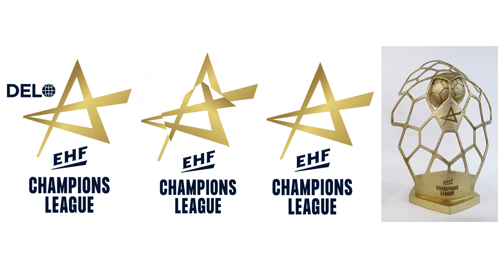
EHF Champions League
The introduction of the new EHF brand coincided with the launch of the new-look European club competitions structure. Each of the three competitions received a fresh logo, all following the same brand values as the primary EHF brand.
The club competition logos all emphasise an individual tile on a handball. The form becomes a strong abstract symbol for the club competitions, including the pentagon visible in the distorted version of the logo.
The new EHF Champions League logo is the best example of this, with a rejuvenated golden star forming the basis of the refreshed emblem of European handball’s elite competitions for both men and women.
The brand refresh also saw a redesign of the EHF Champions League trophy. EHF Marketing launched a public tender and received a total of 27 designs from companies and artists in 12 countries.
The winning agency was Sustain Awards by Spain’s Oiko Design Office. The core idea of the trophy was to represent a goal as the main objective of the sport, to reflect the dynamic movement of a ball hitting the target and to transmit handball as a team game by forming the net in the shape of a shield. The net itself symbolises the needed connection within a team – all for one and one for all. The form becomes a strong abstract symbol for the club competitions, including the pentagon visible in the distorted version od the EHF Champions League logo
A new EHF Champions League sound logo and anthem were designed for the top club competitions. Both came to life in the arena and are a consistent complement all audio-visual communications.
EHF European League and EHF European Cup
The EHF European League and EHF European Cup are newly formed competitions in the 2020/21 season. The EHF European League replaces the former EHF Cup as the EHF’s second-tier club competition and the EHF European Cup has become the third-tier competition, replacing the Challenge Cup.
Both competitions come with a new corporate identity, following the EHF umbrella brand identity, using the usual fonts and EHF blue as the primary colour. The two competitions are differentiated by colour: orange for EHF European League and light blue for the EHF European Cup.
As with all EHF competitions, the EHF European League logo is based on the handball element, with the new, orange-coloured logo formed by an abstract version of the letter ‘E’ rotating around the sides of a pentagon. The letter ‘E’ also stands for EHF and Europe. The shape of the EHF European Cup logo also derives from the pattern of the handball – this time in a bright blue.
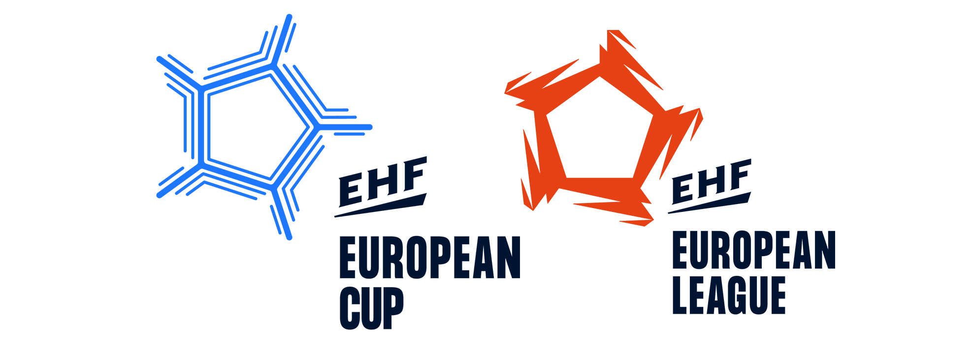
Logo and additional elements that are used in the EHF European League’s imagery symbolise the energy, toughness and intensity that transform from the action on court and the performance of the teams into the visual presentation of the new competition.
A new EHF European League sound logo and anthems were also designed to consistently complement all audio-visual communications.