A new brand, encompassing the history, values and future of handball
In the summer of 2020, the EHF and EHF Marketing unveiled a new brand, encompassing the history, values and future of handball. The brand identity pays tribute to the humble heritage of handball – a unique, family sport available for everyone to enjoy.
The development of the new brand platform began in the summer of 2018 and took several months to complete. It began with the formulation and delivery of the brand core as a strong launch pad for the subsequent development and rollout of ‘products’, engagements and organisational behaviour.
At the heart of the new approach is an updated and fresh representation of how the origins and successes of European handball are communicated, expressed and promoted.
Therefore, subtle alterations have been made in the visual presentation of the EHF and its associated competitions, with a newly developed design created to offer consistent communication of the new umbrella brand across all European competitions.
The brand core serves as a guide for the EHF, describing the reason for its existence, the culture it presents, how it sees itself and the perception others have about the federation, but also how it wants to be seen, what it does and the purpose it aims to fill.
From the core, the newly developed EHF Brand Design System guides effective, consistent delivery of the new handball umbrella brand towards all stakeholders across all European handball competitions. The system is built on the ambition “Empower to inspire” and aims to give the EHF the tools to galvanise the various aspects of handball through a unified front.
The system implements new or adapted brand elements, such as logos, colours, typography, imagery and sound for the club and national team competitions. It is intended to serve as a working tool for partners and stakeholders involved in brand delivery in order to show a unified picture to the world when communicating the European handball brand.
The shape of a handball itself is referenced throughout the entire EHF brand system. On a national team level, the spherical shape of the ball is used to empower all national team competition logos.
By emphasising an individual tile on the ball – represented by the pentagon and the lines which form the stitching – the form becomes a strong abstract symbol for the club competitions, including the pentagon, which is visible in the distorted version of the logo.
New logos were unveiled for club competitions and the beach handball discipline, and a logo template for EHF EURO competitions was introduced.
Imagery associated with the brand focuses on the intensity of on-court action, the emotions of the players, and the passion and dedication of handball fans.
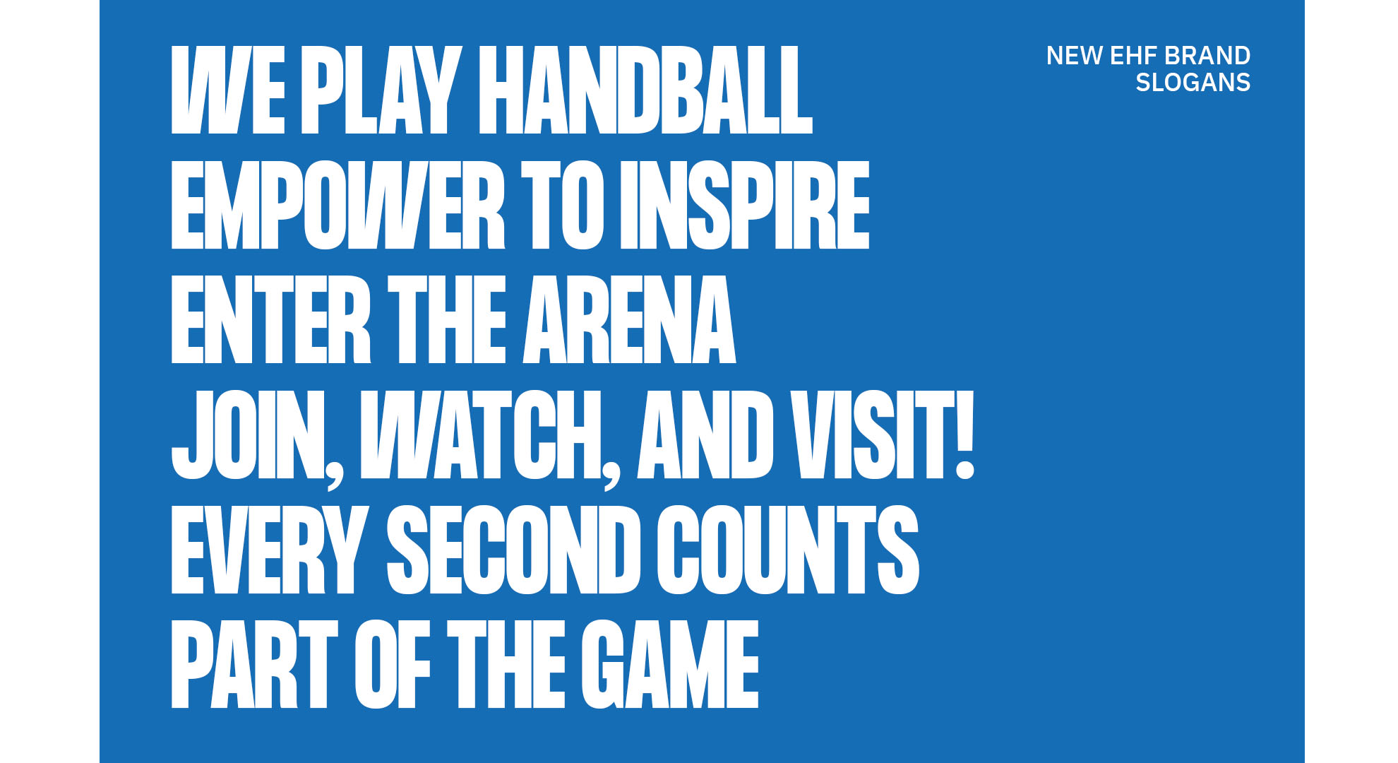
New brand claims were also introduced, to reflect the fact that, while playing handball will always remain core to the EHF strategy, the federation does more than that.
The brand claims, such as “We play handball”, “Empower to inspire”, and “Part of the game” are aimed at uniting the many different aspects of handball through the brand design system.
While the new brand identity heralds the start of a new era, the goals remain the same as they have always been: to encourage the public to pick up a ball and join their local club, to promote the highest profile matches on television and across the digital ecosystem, and to motivate fans to experience the spine-tingling atmosphere of a live match inside Europe’s biggest handball arenas.
CIRCLE AS THE BASIS FOR EHF EURO COMPETITIONS
Logos for EHF EURO events are created by the local organisers of each edition. To assist, the EHF has established a logo design template to ensure coherency of the EHF brand throughout all future tournaments.
By following these guidelines, local organising committees are able to build an official competition brand that is clearly related to the EHF. Every EHF EURO competition adopts this shape as the base of all of its logos, thereby ensuring a clear visual relationship within the EHF logo family.
The structured use of other design elements, such as fonts and colours, strengthens this relationship. This approach ensures a recognisable brand throughout all EHF EURO competitions.
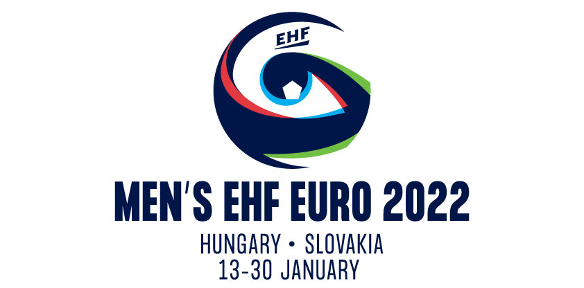
The template is focused around a circular shape to represent a handball, and includes the EHF logo within the main logo. EHF brand typography – identifying the competition and its dates and location – completes the template.
Using the EHF EURO logo template, the organising committees for the Men’s EHF EURO 2022 in Hungary and Slovakia have created a logo system for the event in January 2022.
This striking design features the EHF primary colour, a dark blue, together with the national colours of both host nations – red, green, white and blue. The logo relates closely to the event’s motto “WATCH MORE. SEE MORE.”, highlighting the many opportunities for fans around the five venues.
In due course, a complete overhaul of the branding for younger age category events will also be rolled out.